The Longest Yard
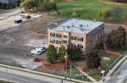
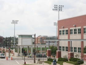
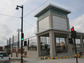
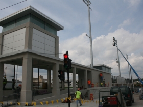
Why does MSOE's new soccer field and parking lot make us think of a prison?
Nope, it’s not the highest, best use of the land. In February 2013, while speaking about MSOE’s commitment to downtown Milwaukee Dr. Hermann Viets, President MSOE, said “…we could certainly do better.” May we suggest the same applies to this ill-designed parking complex.
Photo Gallery
Friday Photos
-
Largest Port Investment in 60 Years Is Only Getting Bigger
 Mar 13th, 2026 by Jeramey Jannene
-
UCC Building New Housing Facility
 Jan 9th, 2026 by Jeramey Jannene
-
Work Underway On New Northwest Side Community Center
 Oct 31st, 2025 by Jeramey Jannene


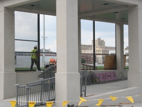
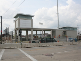
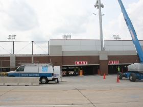











what idiot designed this thing?
“penitentiary”
Oh man, you’re so right. That really does look like a bloody prison. Ugh.
I beg to differ. The new field and structure is looking awesome. Classy brick facade that matches the Kern Center. Plus there’s going to be retail facade on the north end and a much needed public park facing Water Street. The Water Street area has never seen it so good. Finally there’s an end to the years of piles of torn down freeway rubble getting covered with sea-gull poop. Every modern structure will have something architectually unique at the corners, which wont look like towers once the walls are built, and no prison has a fancy glass facade like this. Thank goodness for MSOE. Otherwise, this area of urban decay would go another 10 years untouched.
Two large lawn areas enclosed by new trees,
Pedestrian paths connecting to Water Street, Broadway and Market Street
12,000 square feet of new retail space
Plaza for tables and chairs
Dedicated pedestrian thoroughfare in the historical location of Ogden Street.
I don’t know how people can reasonably complain. There was absolutely nothing else coming to build in that area, and this can only help. There was no street life there to kill, and it was a black hole of city wasteland. Not everything built needs to rigidly conform to vision of what city planners want it to be.
I think it looks great
Mr. Reid is correct in his assessment. The light towers in particular needed to be much better articulated. They and the rest of the building could have used a bit more design. Also, bands of brick always look silly when suspended above voids, as here. Way too much going on here. Many of the troubling details were fudged in the renderings by the architect Uihlein Wilson. [See link]
Senior partner David Vogel Uihlein, Jr. is a member of the Board of Regents of MSOE. This is disclosed in MSOE annual reports. The firm has done much better work. Hopefully this building will be short-lived due to the increasing demand for downtown living.
Finally, people who gripe about the freeway being removed should bear in mind the tremendous amount it destroyed. This could have been avoided. It may take several phases of redevelopment for that area to regain its original vitality. It will never return to its orginal condition of hundreds of separately owned parcels, though.
http://www.uihlein-wilson.com/portfolio/boards/msoe-soccer-field.html
It would have cost more, but it should have been an underground garage with the playing field at grade (or even sunk a bit) so the field could be seen from the street.
Don’t forget that wonderful retail space!
…That’s on the wrong side of the building and will inevitably be a failure…
#7 Anon:
This is a sloping site. That’s why this thing is built into the hill. An at-grade soccer pitch would not give you a level playing field (to coin a phrase). You’d have to excavate and would wind up with a 40 foot or higher cliff at the east end that would be even more unsightly than this.
Horne, short lived? Are you that crazy? Where were the developers clamoring for that land as it was? The demand for downtown living will never be enough to buy away newly developed property from MSOE. Its a parking structure, not the Guggenheim Museum.
This is a frustrating article to read. As a student in the area, I have walked past this empty lot for years. Never an attractive sight, it can be remembered as overrun with gravel, weeds, and a general consensus of uselessness among the large student population here. This image is certainly less inviting then the design being implemented by MSOE. Comparing the design to a “prison” and maintaining this illusion through comparisons of jersey colors to inmate uniforms has no merit and should not make as intellectual publication. Practical, purposeful, and almost-entirely financed through private means, this project will enrich the lives of those whom have been most acquainted with this once vacant and unsightly property.
Spot on UM. This building disappoints for so many reasons. And it all starts with the way it blatantly goes against the Park East planning guidelines set forth to ensure good urbanism:
1. A street-life-killer of at least 3 city blocks. Sure, there was no street life to kill in the area. This building’s design will ensure that none will flourish in the near future.
2. Sure to fail retail space… It’s sunken from the sidewalk with low ceilings and small windows. Not to mention off the beaten path. These will be difficult conditions for any retailer to overcome.
3. The one redeeming factor is the pocket park along Water Street. Unfortunately it’s slated to become a surface parking lot down the road. Funny that proponents of this project never bring that up.
4. The design relates to the Kern Center. If “clunkitecture” was an accepted architectural term, the Kern Center would be cited as exhibit A.
I know that some are thrilled that anything got built here. That’s the mentality that leads to a good-enough city rather than a world-class city. I would have gladly lived with rubble while development continued to press toward this site making it much more valuable (which is exactly what’s happening right now). Better yet — do the same project but really make the design matter. There’s many examples of excellent new parking structures around the country that use place-making, creative use of materials, and street-edge programming to make the most out of a tough situation. This project went halfway in every regard.
It’s a shame that Milwaukee no longer has a respected architectural critic to call out these kind of projects in the planning phase. While I didn’t always agree with Whitney Gould’s opinions, her commentary almost always made projects better.
Does anyone who is critical of the design live in the area? Maybe not. I do, however, within four blocks. Now that the structure is up, most of views of the garage, from the east and west specifically, result in a much better view than what was there before. I’m pleased with how it sits into the side of the hill without being obtrusive to the surrounding area. It will obviously provide for much needed parking spaces and will eliminate so many cars sprawled throughout the neighborhood during the school week. I’m also looking forward to what else the structure will bring to the area and surrounding businesses in the near future: more money, activity, youth….LIFE! MSOE recently bought the vacant building to the south. So they are concerned about their neighborhood and are investing. And Milwaukee’s industrial past will eventually resurge through local business and educational institutions such as MSOE, UWM, MATC and others. As a nearby property owner I’m pleased…God bless!
@Chris P Yup. I live just a few blocks from it, and yeah I think it looks like a prison yard.
While I agree the design is quite lacking, I just hope that MSOE utilizes the field to its full potential. There is an opportunity to use this field for intramural soccer nightly, or, if lacking student interest, open the field up to public recreational leagues at a small cost. This would activate that block, allow the university to seek on field advertising of local area business, and increase downtown traffic on an almost daily basis during the warmer months. A downtown outdoor rec. soccer league should take no time to fill up. Plop some food trucks along the blank walls, maybe hire some local artists to create additional ways to make it more inviting, and you can turn around something that was originally uninspired.
@Tracy Good points. If MSOE can find a way to keep it heavily used by the community and get some food trucks to show up at various events that could definitely help.