
How To Make Wisconsin Richer
ALEC's annual 'Rich States Poor States' report is at odds with its own data.

Wisconsin Welcomes You sign. Photo by Andreas Faessler, (CC BY-SA 4.0), via Wikimedia Commons
Starting in 2008, the American Legislative Exchange Council (ALEC) has annually issued a new edition of its Rich States Poor States report. The report offers policy recommendations it promises can help poor states become wealthier.
It analyzes state policies in two ways. The first is how well state policy conforms to the report’s policy recommendations. It refers to these as “outlook” measures. The second is made up of three “performance” measures–State Gross Domestic Product, Absolute Domestic Migration, and Non-Farm Payroll. Each state is ranked compared to all states. Thus, a rank of 1 is best, while 50 is worst.
A sense of the report’s policy or outlook measures can be gleaned from the ratings for Wisconsin. Wisconsin ranks highest (40 or more, worse than 40 of the other states) on three measures: the top marginal personal income tax rate, personal income tax progressivity, and average workers’ compensation costs.By contrast, Wisconsin rates a one (best) on three measures: not having an estate/inheritance tax, no state minimum wage, and being a right-to-work state.
Taken together the fifteen policy descriptions that the report advocates conform to a conventional Republican economic prescription: keep taxes low, particularly on wealthy people and corporations, wages low, and unions weak.
Therefore it is not surprising that Republican-leaning states tend to score better on these policy recommendations. Below is a graph which compares the states’ outlook scores (on the vertical axis) to the vote for Donald Trump in the 2000 presidential election. Although there is considerable scatter, in general the higher the vote for Trump, the better the state’s rank on its outlook. Some of the top-ranked states by the report, like Utah and Idaho, also had some of the highest percent of voters supporting Trump.
I have included the coefficient of determination R2 on the chart. This is a number between 0 and 1 that measures how well a statistical model predicts an outcome. An R2 of .46 indicates that about half of the variability in the outlook is determined by the variability in the 2000 vote.
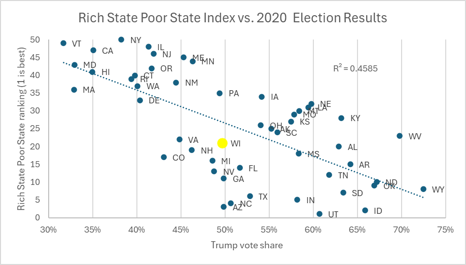
Rich State Poor State Index vs. 2020 Election Results
The fact that some of the report’s highest-ranked states in outlook are Utah and Idaho raises the question: how well does its recommendations on the best policies to become rich actually work? To measure this, the next graph compares the report’s outlook rank (on the horizontal axis) to its real state per capita GDP, as reported by the US Bureau of Economic Analysis. For starters, the overall relationship between outlook score and GDP is quite weak, as suggested by the R2 of .12. Still, to the extent that one accepts that the relationship is real it suggests that scoring high (a bad thing) for outlook is related to higher per capita GDP. It is notable that the four states with GDP per capita over $80,000 — New York, Massachusetts, Washington and California — all rated negatively in the report’s outlook rank.
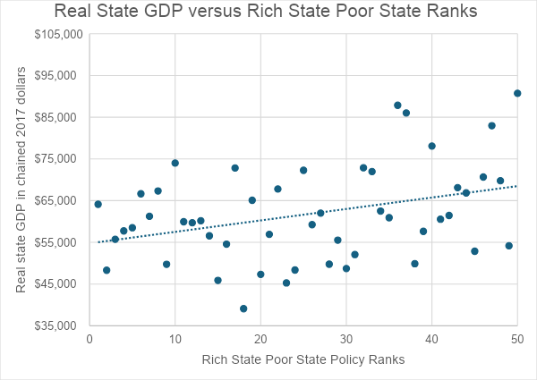
Real State GDP versus Rich State Poor State Ranks
The next graph compares each state’s life expectancy to the report’s outlook rating. Again, the relationship is a weak one, but to the extent it exists people living in states scoring poorly on the outlook scale tend to live longer.
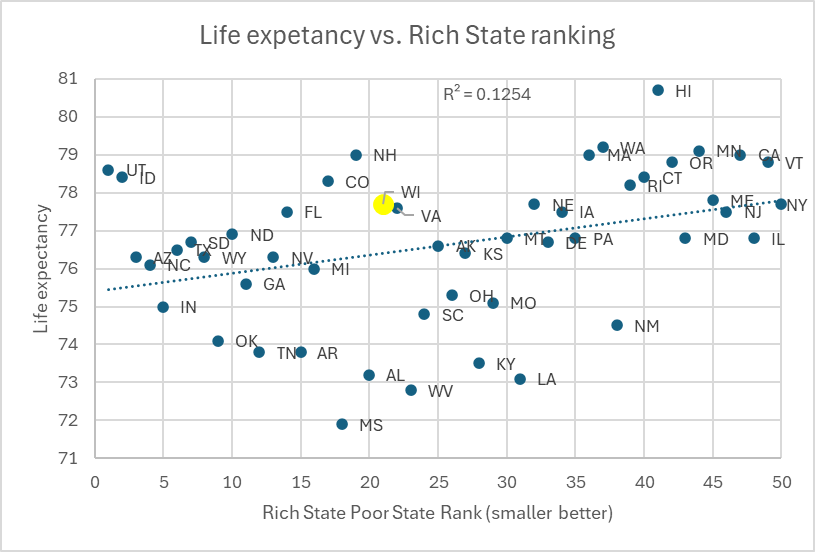
Life expectancy vs. Rich State ranking
While the benefits of the report’s advocated policies are small or nonexistent, they come at a huge cost if one values a society without huge differences in income or wealth. The Gini coefficient is commonly used to measure inequality. A Gini coefficient of 0 reflects perfect equality whereas a value of 1 means that someone has all the wealth or income.
The graph below shows the historical value of the Gini since 1963. Between 1963 and about 1980, the American Gini index was going down, meaning that inequality was decreasing. However, this trend then reversed and the index started rising. It is relevant, I think, that this reversal corresponded with the start of the Reagan administration with its emphasis on reducing taxes, particularly taxes on wealthy people.
One of the three authors of the Rich States Poor States report is Arthur Laffer, the inventor of the “Laffer curve,” who argued that reducing tax rates paid for themselves as the resulting increase in economic activity brought in more tax revenue. Economists have been unable to identify any real-world situation where this scenario applies. Thus, cutting taxes always increases the national debt, unless some way is found to offset the revenue decrease.
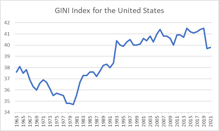
GINI Index for the United States
The next graph shows the current breakdown of income between five groups. The least prosperous 20% of the population receives 3.9% of income. This compares to the most prosperous 20% who received 47.3%.
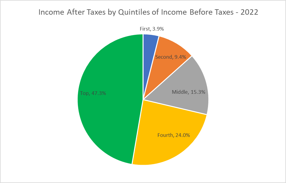
Income After Taxes by Quintiles of Income Before Taxes – 2022
The belief that cutting taxes is the key to prosperity still dominates Republican thinking. For example, one of ALEC’s current campaigns is to convince Congress to make Trump’s Tax Cuts and Jobs Act permanent. Although the immediate economic effect of this is uncertainty, doing so is certain to lead more inequality and a substantial increase in federal debt.
Meanwhile, Wisconsin’s policymakers might want to consider just how poorly states who embrace all of ALEC’s recommended policies are doing, and how wealthy some of the states that don’t embrace them are. That’s not just my take, that’s according to the report’s own statistics.
If you think stories like this are important, become a member of Urban Milwaukee and help support real, independent journalism. Plus you get some cool added benefits.
Data Wonk
-
How Global Climate Change Affects Milwaukee
 Mar 11th, 2026 by Bruce Thompson
-
Will Lawsuits Demanding New Congressional Maps Succeed?
 Mar 4th, 2026 by Bruce Thompson
-
What the 2025 Elections Data Tells Us
 Feb 11th, 2026 by Bruce Thompson


First step.
Throw out the retrograde GOP state legislature in November.