
How Bad Is The Pandemic Recession?
The numbers tell a sobering story. Will policymakers learn from it?

On March 19th, the downtown Milwaukee Punch Bowl Social laid off 91 employees. Photo by Jennifer Rick.
Wisconsin and the nation have seen many recessions. How bad is this one compared to the past and what might we learn from that?
The chart below shows the American civilian unemployment rate since January 1976 (the black line). Each of the four recessions (counting the double dip recession in the early 1980s as one) causes a peak in the unemployment rate, with the latest one spiking the highest. Each recession is followed by a recovery period in which the unemployment rate goes down and employment goes up.
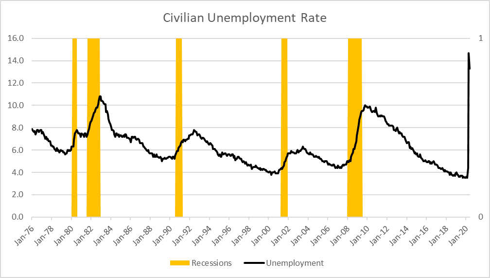
Civilian Unemployment Rate
The next chart shows the growth of jobs during each of the four recoveries. The vertical scale shows the percentage increase in employment compared to employment at the start of the recovery. The horizontal scale shows the number of months since the start of the recovery:

% Growth in US Jobs in Last 4 Recoveries
- Early in the administration of Ronald Reagan, the Federal Reserve tightened the money supply. This caused a sharp recession but succeeded in driving out inflation and was followed by a strong recovery. The end of the recovery in the early 1990’s during the George H.W. Bush administration contributed to Bush’s loss to Bill Clinton in the 1992 election. This recovery is shown in blue on the graph.
- A second recovery started late in the Bush administration and led to strong growth during the subsequent Clinton administration, resulting in government surpluses. It is shown with a red line in the graph. Its end is often attributed to over-investment in “dot-com” startups.
- This was followed by a short-lived recovery during the George W. Bush administration (shown in green). It ended with the Great Recession, generally attributed to financial speculation and the collapse of the housing bubble.
- Most recently, there was the recovery from the Great Recession, that started in the Obama administration and continued through the first three years of the Trump administration (shown in black). It ended spectacularly this year because of the threat of the COVID-19 virus and the need to practice social distancing to limit its spread.
One notable feature of the latest recovery is the lack of evidence that the presidential transition from Barack Obama to Donald Trump (in the 83rd month) made a measurable difference in the number of jobs. Between February 1, 2010 and January 1, 2017, the United States added jobs at the rate of 192,000 per month. Between that date and February of this year the rate dropped to 183,000 per month. While this does not prove that Trump’s policies caused the downturn, it certainly does not support claims that Trump’s tax cut created jobs.
A notable feature of the three longest recoveries is that each is weaker than its predecessor. The annual growth rate of the 1980s recovery was 3.2 percent, compared to 2.3 percent in the Clinton recovery, and 1.8 percent in the recovery that just ended.
Another is the growth of income equality over this period, as reflected in the Gini index as shown below. The higher the Gini index the greater a society’s income inequality. For example, if every member of a society had the same income, the index would be zero. If all income went to one person, the index would be one.

Gini Index 1947-2018
It seems likely that growing inequality is a contributor to a less robust economy. If a larger proportion of wealth and income flows to people who are already wealthy, that holds down demand for goods and services. Although there are many factors that may contribute to inequality, government policy also plays a role.
At the beginning of the most recent recovery unemployment rates varied widely among the states. The next chart shows unemployment rates for Wisconsin and its neighbors—Michigan, Minnesota, Illinois, and Iowa, as well as the US in recent years. Coming out of the Great Recession, unemployment rates varied widely among the states. However, as the recovery progressed, rates converged so that today they all are just below 4 percent.
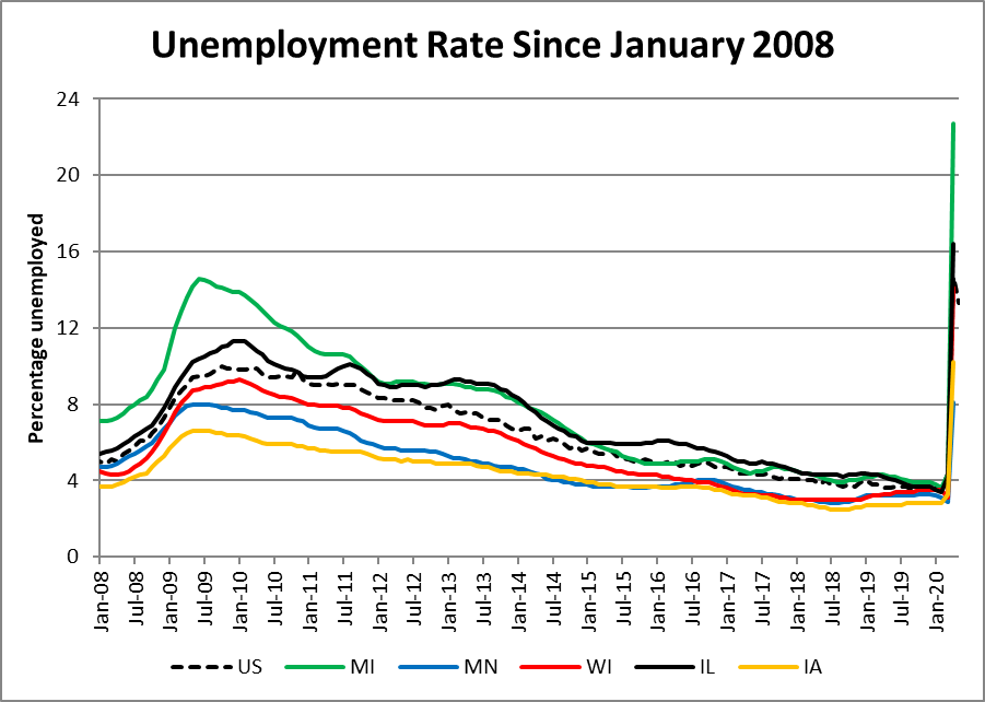
Unemployment Rate Since January 2008
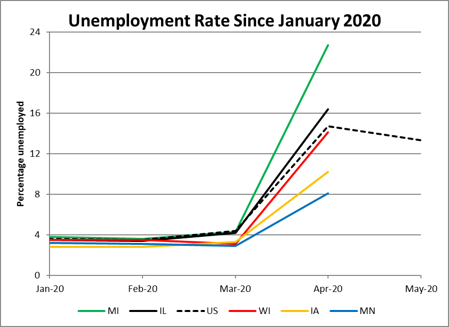
With the decision to put the economy on hold to minimize the spread of COVID-19, unemployment rates jumped both nationally and in Wisconsin’s neighbor states, as shown in the next graph.
Unemployment Rate Since January 2020
As the graph shows, the rates for April, when the effect on the economy first seriously hit, vary widely. Some of this variation may reflect difficulties state agencies have in processing claims for various forms of relief. Perhaps we will get a better picture when the state employment and unemployment numbers for May are released on June 19.
As it is, the only estimate available for the May unemployment rate is for the whole nation. It caused some surprise by showing a decline from 14.7 percent to “only” 13.3 percent. The good news is that it shows the programs aimed at counteracting the coming recession are having an effect. The bad news is that the U.S. Senate leadership is threatening to use the lower May number as an excuse to delay further aid.
The next graph shows job growth since 2011 in Wisconsin, its neighbor states, and the nation. Like the nation, the states saw a substantial drop in jobs in April: it looks like they have fallen off a cliff.

Percentage Job Growth Since January 2011
What are the takeaways of this history and data? Even if the reported decrease in the unemployment rate turns out to be a real one, the rate is still very high by historical standards. The danger is that it gives ammunition to Republican senators who are resisting the passage of legislation extending help to those losing their jobs, to small businesses threatened with closing permanently, and state and local governments faced with lower tax revenue and higher costs. Given the unemployment rate still remains higher than at any time since the Great Depression, that could be a huge mistake.
Data Wonk
-
Who Do You Trust to Conduct Elections Fairly?
 Apr 6th, 2026 by Bruce Thompson
-
Is Non-Citizen Voting a Real Threat to Elections in Wisconsin?
Mar 18th, 2026 by Bruce Thompson
-
How Global Climate Change Affects Milwaukee
 Mar 11th, 2026 by Bruce Thompson