The Ghost Signs of Milwaukee
New book captures a fading part of the city’s history.

Fading Ads of Milwaukee by Adam Levin.
Amid the burgeoning city expansion, revitalization and progress, one can catch a glimpse into a bygone era. Fading ads marked the once-flourishing businesses from decades prior. One will see these hidden gems among the high-rise buildings in downtown Milwaukee and nestled into surrounding neighborhoods such as Walker’s Point, Brewer’s Hill and the Third Ward. From drugstores and supper clubs to beer bottlers and tanneries, from bowling alleys to local watering holes, they are reminiscent of life in Milwaukee from the late 1800s to the 1960s.
Some were once vibrant, hand-painted murals etched into brick building façades. Others lit up the evening sky with neon—flashy and exuberant. They ranged from simple and restrained to complex and extravagant; all proudly displayed by the owner. These signs were not simply “advertisements” or geographic markers. They represented freedom, expression, creativity, entrepreneurship, opportunity and success. They were reflections of Milwaukee’s diverse culture.
Conveniently situated on Lake Michigan, Milwaukee was a booming port city in the early 1900s and a beacon of hope for thousands of European immigrants. Neighborhoods were settled by various ethnic groups, dominated by the Poles, Germans and Italians, each distinct for its culture and language. Each neighborhood had its own flair, and the businesses and signs reflected the culture and needs of the community.
These signs have borne witness to the rise of modern capitalism and individualism. Some have weathered the storms of the Great Depression.
Many others survived to see the light again well into the postwar economic boom. Today, they are steadily disappearing to make way for a “new” time. Those that remain are faded, decayed and neglected—soon to be a distant memory. But they are forever preserved in these photos, reproduced in the new book, Fading Ads of Milwaukee. Two examples:
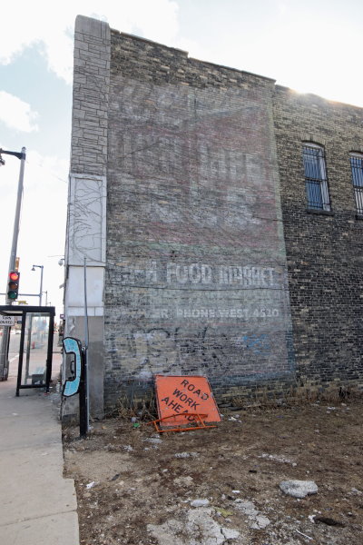
Miller High Life. Photo by Adam Levin.
Avert your eyes from the markings left by a local graffiti artist on the bottom outline of this sprawling sign. Nearly fading from existence, this ad originally encompassed the entire building façade.
At first glance, the most distinct words are near the bottom edge of the sign: “Food Market” and “Phone West 4520.” It is likely that at one time these were two separate signs, the newer overlaying the older. The line of text following the food market lettering is almost completely illegible. It also looks as if a different font was used, which further supports the theory that these are two overlapping signs. Heavy winds, rain and vines, which have presumably damaged the surface for decades, have contributed to the overall decay. However, with an intent gaze and squinted eyes, one can see “Miller High Life Beer” over a red background comprising the top two-thirds of the sign.
Miller Brewing Company has consistently ranked in the top three of breweries nationwide and has battled for the number one position with Anheuser-Busch for decades. Originating from the Plank Road Brewery, Miller Brewing Company was founded in 1855 by Frederick Miller, who arrived from Germany with brewing knowledge and a secret, unique brewer’s yeast in hand. Miller spent all but $1,000 of the $9,000 he had in his pocket on arriving in the United States with his wife, Josephine, and son, Joseph, for the Plank Road Brewery. Coincidentally, the Plank Road Brewery was owned by Frederick Charles Best, son of the Pabst Brewing company founder. In 1903, Miller High Life Beer launched, and it was named the “Champagne of Beers” for its effervescence, high quality and unique champagne-style bottles. The label portrayed what it marketed itself to be: “the high life.” Embellished with gold trim, the label represented a pricier, higher-quality option than other competitor brands.
Little is known about the food market that was once here. The four-digit phone numbers preceded by a word were prominent between the 1920s and 1950s. We can presume, based on the extensive fading, that this was likely painted in the 1930s.
At the time of this writing, a revitalization project has been discussed for a section of the Concordia neighborhood, which has called for the demolition of this building. Fortunately, this image will preserve the essence of the once-popular neighborhood food markets, obsolete phone exchanges and sprawling painted beer ads…
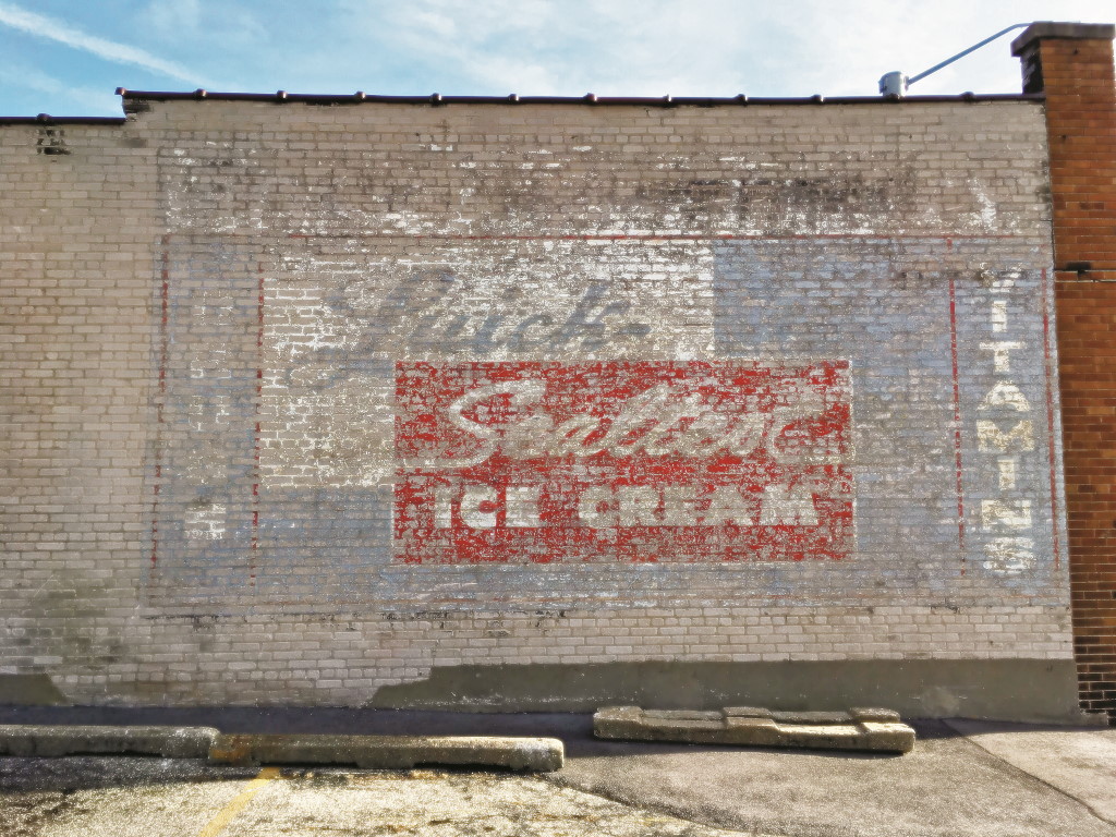
Sealtest Ice Cream. Photo by Adam Levin.
Our photo journey begins in the working-class suburb of West Allis. This fascinating ad, painted on the side exterior wall facing a parking lot, is located at 6780 West Lincoln Avenue. The building is a simple, single-story commercial structure with an unusual façade: a combination of red terra-cotta brick and Lannon stone (so named because it was discovered in Lannon, Wisconsin).
Here we find an interesting painted ad for Sealtest Ice Cream facing a parking lot. The blue painted canvas background was probably originally much brighter and more vivid than how it shows today. The words “Sealtest Ice Cream” are visible in the forefront inside of the center red section of the sign. But what does the sign below, in the faded blue, mean? It may read “Luick Dairy.” On the right side vertically aligned, the word “Vitamins” can still be seen, despite the now-complete absence of the letters “V” and “S.” Did a pharmacy at one time occupy this space? Without city records confirming this, it is a probable assumption.Wisconsin, aptly named the “Dairy State,” is one of the largest producers of dairy products in the United States. It is not surprising to find an ice cream distributor and warehouse just outside of Milwaukee. What makes this sign interesting is that it appears that, when Sealtest was acquired by Luick Dairy in 1929, the existing Luick Dairy sign was simply painted over with the new Sealtest brand. While it may seem careless to not invest the time in removing the formerly painted sign before painting the new one, it is essential to remember that the majority if not all of the paint used in this period was lead-based. Used to enhance durability and protection against the elements, lead paint is difficult and tedious to remove, notwithstanding the health risks it presents in the process. Without conclusive data to support this assumption, based on the fading of the sign and history of the two businesses, we can presume that the original Luick sign was painted in the 1920s, followed closely by the second sign in the 1930s.
Fading Ads of Milwaukee, a new book published by Arcadia Publishing, can be purchased through the publisher on Arcadia’s website.