
New, Improved, 40% More Art!
The art museum’s new reinstallation promises much more and, alas, delivers.
More than a decade has passed since the Milwaukee Art Museum reinstalled its art collection. In the mean time, the collection has changed, and so have we.
Ideally, reconfiguring the collection is an exercise in curatorial judgement. The vaults in the Milwaukee Art Museum are full of minor works, embarrassing frauds, and oddities. There is a lot to choose from. Less than 10 percent of the collection is on view at any one time. The first job of curators is to show us the important stuff, which is what a museum is after all.
The museum’s main talking point for the reinstallation is that there are a thousand new works on view. I’m skeptical of that figure. That would be a 40 percent increase in art, which sounds like a laundry detergent claim.
And more is not necessarily better. I have never heard a single soul complain about a paucity of art at the museum. More art is needed to fill a museum expansion. But lot more space to fill is a challenge. Like an email, longer is not necessarily better.
To bring some order to all the different art and all the different voices talking over each other, museums often put everything in a grand historical narrative. But most don’t have the work to bring the history of art to life. Without Picasso, Matisse, and Cezanne, Modernism at the Milwaukee Art Museum is like telling the story of rock & roll starting with Pat Boone or turning someone on to Bob Dylan with his Christmas Album. You have to go to Chicago to hear Little Richard or “Like a Rolling Stone.” The same could be said for the MAM’s small holdings of Impressionism.
So the fact that the reinstallation isn’t strictly historical is probably in its favor but still leaves us to consider what kind of organizing principles have been used.
Let’s start with a Deborah Butterfield sculpture plunked in the middle the Kohl’s Art Generation children’s gallery. As Grace Glueck wrote in the New York Times, Butterfield’s sculptures of horses“…have a freshness, which comes from the artist’s regard for them as individuals….she thinks of them as personifications of herself…They seem to express the very spirit of equine existence.”
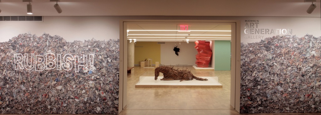
“Horses die, and they break your heart, just like children do,” says Butterfield who lives on with horses on her Montana Ranch.
Yes, her sculpture is made from sticks, but reducing this work to a trivial grade school art lesson by connecting it to this display of “RUBBISH!” is demeaning to anyone, especially kids, who could be animated by the expansive meaning of the work.
The Butterfield would be far more powerful in front of a white wall by itself.
Curators spend most of their time making sure the works get along and don’t fight with each other. So why is a Thomas Struth photograph (2007) and Anselm Kiefer (1982-1985), who inhabit conflicting worlds and different generations doing across from each other? Struth’s restrained formalism is neutralized by Kiefer’s wildly expressionistic burnt post-holocaust landscape. They are both German, but everything else is at cross purposes with each other. It’s like mixing an acid and base, and getting salty water.
You don’t need an art history lesson to see the next problem. Kenneth Nelson’s minor aluminum and wire sculpture has been bouncing around the museum for a long time. The problem in this case, it landed right in front of a truly great work, Robert Morris’s draped felt piece, a seminal work in art history that loses its entire effect behind Nelson’s contraption.

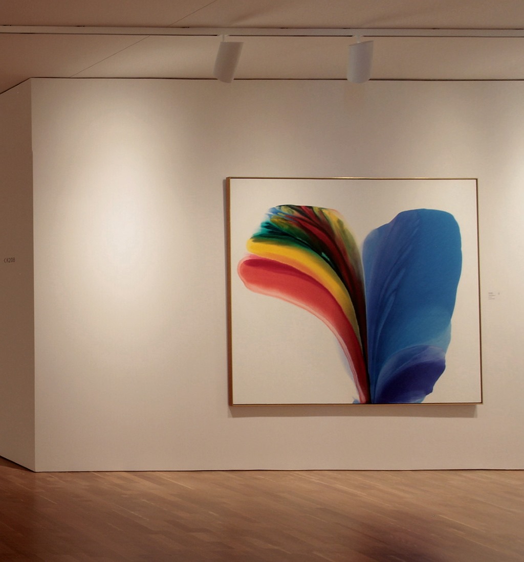
Or consider this Paul Jenkins painting (“Phenomena 831 Broadway,” 1963). A dreadful work, but why is the wall instead of the art work lit?
Lighting the wall rather than the art is the rule rather than the exception in many of the new galleries. Anybody who buys a work of art and installs track lighting figures out where to point the fixtures. Why haven’t the MAM curators?
Here they shine a light everywhere but on this Jean Dubuffet (“Court les rues,) 1962) painting.

And here they light everything except the art. The lighting casts a white haze that dematerializes the art, all by Donald Judd.
![AAA[Group 3]-IMG_0061_IMG_0066-6 AAA](https://urbanmilwaukee.com/wp-content/uploads/2016/03/AAAGroup-3-IMG_0061_IMG_0066-6-AAA.jpg)
![bbbb[Group 3]-IMG_0061_IMG_0066-6 AAA](https://urbanmilwaukee.com/wp-content/uploads/2016/03/bbbbGroup-3-IMG_0061_IMG_0066-6-AAA.jpg)
In this bottom picture I fixed the light in Photoshop and the objects become three dimensional. It’s the same idea retailers use to draw your attention to what is important. Lighting the art is the difference between knowing the museum has three Judd sculptures and having an art experience looking at them.
Some things you can correct in Photoshop. Not in this case. Mark Rothko made impossibly delicate gradations that recalibrate our senses. Too subtle to survive any kind of reproduction.
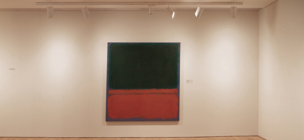
When properly illuminated, the dark fields shimmer like twilight over Lake Michigan. This painting is supposed to radiate light instead of being a smudge on the wall.
Then there are the colors used on the walls. MAM director Dan Keegan told the Chicago Tribune that “more than 60 paint colors were used on walls with an aim to creating surprise and fending off the dreaded “museum fatigue.” Well, he got that exactly wrong. “Museum Fatigue” became a term in the early 20th Century when collectors started sharing their butterfly and rock collections with the public in natural history museums. It had nothing to do with color. Research found that repetition of similar things arrayed in a linear fashion was the culprit, which is exactly the way the Milwaukee Art Museum presents its collection. In art museums there is a good reason walls end up white or some neutral shade of gray. Painters figured this out a long time ago — colors effect one another and colored walls can clash with colors in the paintings.
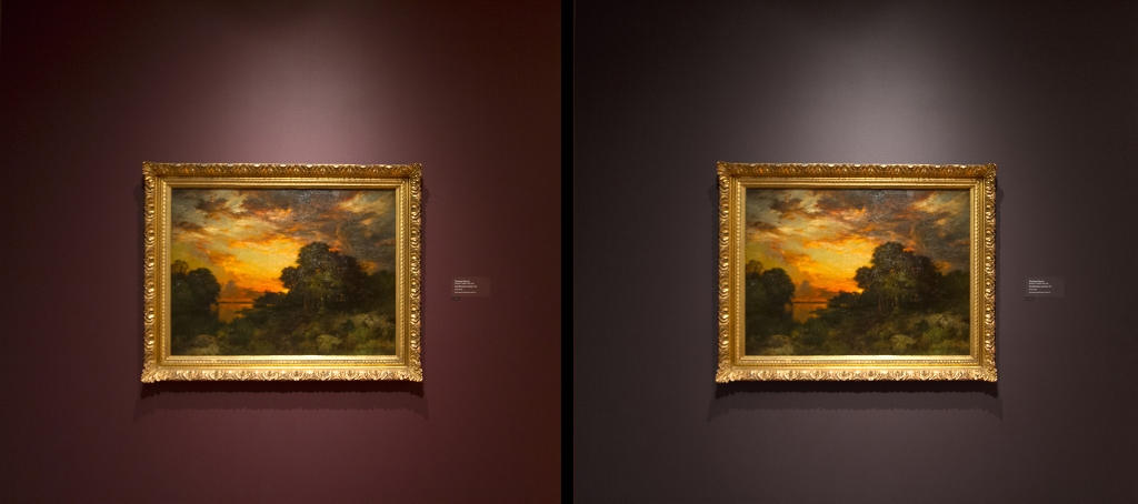
The wine-colored wall on the left drains Thomas Moran’s landscape (1889) of its depth and spectral clarity, compared to the photoshopped version of the right. Marinating a painting in wine is never a good idea.
Perhaps this is meant as a nod to the way we think paintings were shown at the time. But this historical correctness is specious. First of all, we don’t really know the colors of 19th Century galleries. Even if we did, we learned a few things since Queen Victoria’s reign. The germ theory of disease for example, and the way color works in our minds. There are lots of good colors in paintings, but not so many that go with paintings.
The galleries are riddled with unforced errors that can be easily corrected. The larger problem is the overarching idea. The museum’s main talking point is the increase in new works on view. To help make room for more art the new east entrance of the building is sealed off from the lake. There’s a front desk flanked by a commissary. A pretty uninspiring way to enter the building: nothing says you’re in a museum or anywhere for that matter; you might be entering a corporate office building.
Just inside the new east entrance this space is divided by a wall which in turn is hidden by this dreadful wall paper. On the left-hand side is big 20th Century art; on the right-hand side is what looks like a design store. A leap I don’t want to make.
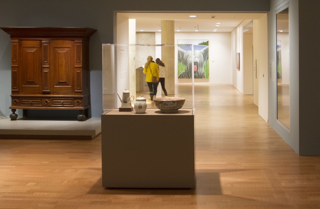
You enter this gallery from the Calatrava and meet up with a hodgepodge of art and pedestals with plastic cases.

The guiding principle of “more” often turns the museum into an overstuffed maze. A hodgepodge of layers with no central organizing principle that makes sense. There are few vistas and little relief from the clutter.

I would have liked coming upon this Alex Katz (“Sunny #4,” 1971) without the plexi-glassed boxed pottery in front. The art gets in the way of the art experience; the Katz work should slowly reveal itself at a distance.
The high points here — and there are some — are at the outskirts of the new installation. The west Galleria flows past works of art, instead of being a dead end, giving Calatrava’s symmetry a purpose. The East Galleria’s entrance to the permanent collection has been brightened up. But I am mystified by the execution. The wall is just kind of stuck there, jury-rigged, totally out of sorts with the rest of the design. On it is a Tom Wesselmann painting featuring a Pabst Blue Ribbon beer can. Nice painting, wrong message — a beer image for visitors to Milwaukee can’t be anything but trite.

A spacious room on the south east corner of the second floor has the best view of the lake you will find in Milwaukee (reminds me of a Rothko painting). It’s at just the right height to flatten out the view. The rectilinear frame is more immediate and transparent than the curvy windows of the Calatrava. The only problem are the fire doors (which you don’t see in this photo) which separate the room from the rest of the museum.
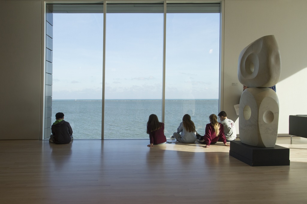
Curators naturally avoid the ultraviolet region of the color spectrum that degrades art, but considering the beauty of the lake views, they’ve gone overboard here. If natural light was controlled, rather than eliminated, there would be less art and more pleasure in the museum.
Meanwhile, there is an entirely different museum downstairs in the Herzfeld Center for Photography and Media Arts. The works are illuminated and spaciously arrayed. Galleries flow into one another. No decorator colors tint the art. You have to see it to appreciate it, it looks a little dull in photos, but works nicely in person.
![[Group 4]-IMG_0080_IMG_0082-3 images](https://urbanmilwaukee.com/wp-content/uploads/2016/03/Group-4-IMG_0080_IMG_0082-3-images.jpg)
So why is this part of the reinstallation so different? Did they just not get to it? It’s in the basement after all. And the art looks fantastic. The photography collection, which is the most comprehensive at the museum, has room to grow on you. The galleries get out of the way. Let the art do its thing. Which is the point of an art museum, to begin with, but somehow got lost in most of this reinstallation.
Photos by Tom Bamberger
In Public
-
The Good Mural
 Apr 19th, 2020 by Tom Bamberger
-
Scooters Are the Future
 Dec 19th, 2019 by Tom Bamberger
-
Homeless Tent City Is a Democracy
 Aug 2nd, 2019 by Tom Bamberger


Great article. Great photos- Hit the nail on the head once again Mr. Bamberger!
Exactly Tom. It’s been nagging at me since I saw the new MAM: what is the matter?. You have indeed nailed it.
This is a most entertaining critique, but MAM’s decision to employ deep rich color is not unprecedented.
The Brooklyn Museum had famously eccentrically-colored gallery walls for many years as part of its showcase American Collection. The first time I saw it I was struck by the distraction from the art of these garish colors. It was disappointing to realize that most of the important work was better viewed on-line or in a textbook.
I can attest from first-hand experience that you are correct: colored walls alter the visual experience of the work in unintended ways. This is especially true for the kind of deep colors shown in your choice of images. Such colors tend to soak up the available light, diminishing the impact of the art itself.
In 2015, the Brooklyn Museum’s new director made rehanging these galleries and getting the embarrassing colors changed to a neutral palette one of her first high-profile initiatives.
That process is underway now. (The collection on display is also being culled, since the old arrangement also lacked curatorial coherence, looking more like a booth at an antique mall than an actual collection that includes many recognizable and important work)
And yet, despite failing the “eye test” (does it offend one’s eyes to look?) there seems to be some actual debate about this strategy: http://www.artsjournal.com/realcleararts/2013/05/what-color-is-that-gallery-the-spring-show-as-trailblazer.html
Meanwhile the consistently mis-aimed lights is just baffling. Was this intention, incompetence or both?
I hope someone from MAM engages your critique with a defense of these and the other choices described here.
Good critique!
Tom Bamberger’s “voice” is the voice of reason and insightful thinking. While it is certainly not his intent, Tom’s observations overshadow all others who imagine themselves to be critics of the “art scene.” Myself included. ,
Got that right Judith