
UWM Tries To Do a Calatrava
Its new research building is a compendium of architectural elements. How do they add up?
The expectations for the building were high.
“It’s a gateway building,” says Geoffery Hurtado UW-Milwaukee’s Associate Vice Chancellor for Facilities. The goal was a building “that elevated the bar on campus, a signature research building that would attract potential students and faulty,” according to Kurt Young-Binter, a Facilities Architect at UWM who worked on the project.
It’s the first new building on the UWM campus in 10 years. The first that leaves an impression in more than 50 years. It’s intended to “present a different face to Milwaukee,” Hurtado says. Designed by David Black of Flad Architects, the building will be the frontispiece for future of UWM, which includes plans for several more buildings, including a new Student Union.
So there’s a lot at stake for the Kenwood Interdisciplinary Research Complex (KIRC), which rises above the tree-line on the North East Corner of Kenwood and Maryland Avenue. No one will say it out loud, but this building is supposed to be the University’s “Calatrava.”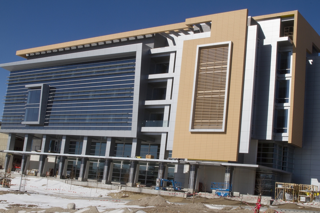 Flad specializes in laboratories — healthcare, and technology buildings for industry and universities. Bluechip clients include Gentech, Amgen, Baxter International, Johnson and Johnson, and the Lawrence Livermore National Laboratory. Flad has built seven buildings at UW-Madison, where they have one of their offices.
They were an obvious choice for the inside of the facility. “Our design aesthetic is intrinsically linked to the bright, the bold, the smart and dramatic,” Flad’s website explains, “We’re not talking about buildings. We’re talking about the people inside them.”
But Flad’s design philosophy, according to their website, emphasizes “reduced waste, maximized value, reduced time to achieve a final solution.” That’s a little too cold-blooded for the signature part of the project. “Gateway buildings” are not Flad’s forte.
The south face, which is also the front, sports the graphic climaxes of the design that wrap around the west and east sides of the facility. A three story grill-work with a silver trim emerges out of an irregular four story coconut colored terra-cotta form that floats off an aluminum slab, that floats off another slab, which is attached to a grid of windows.
To the left, the grill graphic is flipped horizontally and amplified by tampered and angled aluminum outcroppings that jet off the left side of the building. A smaller vertical version of this element is nested inside and embedded in a field of lines carried over from the grill. A veranda curls around the entrances at the south east and west corners of the building. A stout brisole’ zig zags across the top of the building from right to left. The supporting cast includes an assortment of columns of different materials and lengths.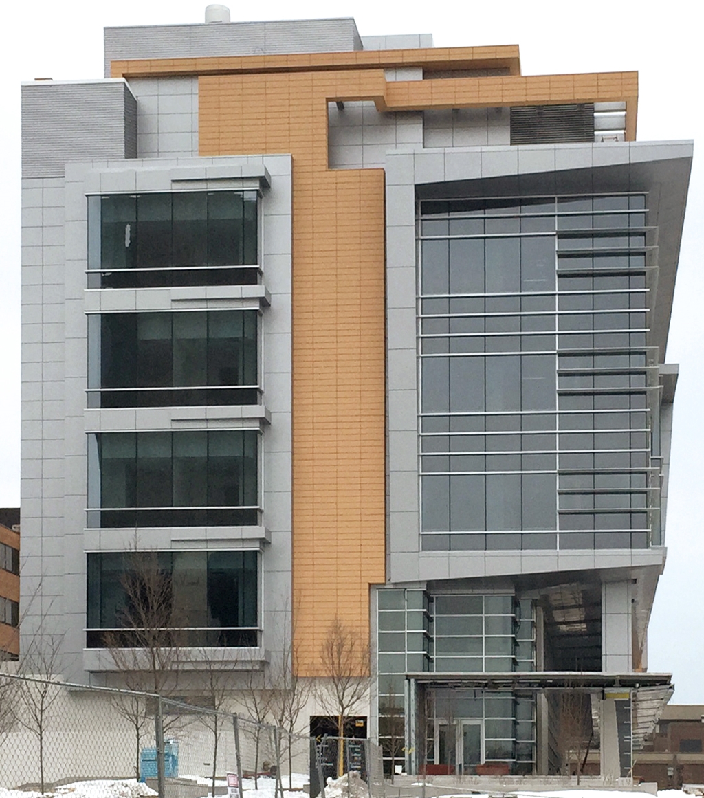 On the building’s east side another set of angled fixtures protrude from the window frames, an faint echo of the the visual dramatics on the front of the building that sweeps around the corner. A ribbon of terra-cotta runs down the middle to hold the design together.
It’s a dense work. Everything is framed and double matted. Rectangles are layered within rectangles, patterns within patterns, boxes within boxes. All the pieces are larger and chunkier than they need to be, which makes the building seems smaller than it actually is.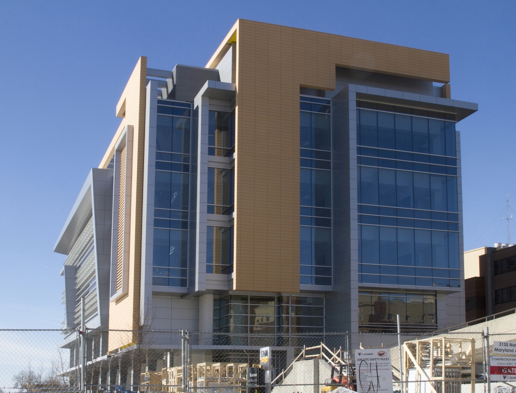 When KIRC tries to turn the southeast corner like an accordion the building begins to really unravel. You can’t tell if the ragged edges collide or overlap. Instead of creating depth, the layers slumps the building into itself. The main entrance falls under a fault line of the spectacle of its dangling parts.
From a distance the KIRC looks like the futuristic radios in 1930’s American homes. They were a little baroque back then, but told a zippy story. Here the narrative eludes me. A building needs a sense of itself, something you can wrap your mind around, to gain momentum to turn a corner.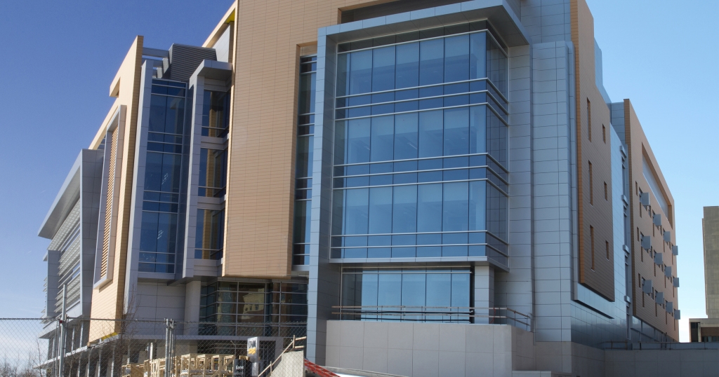 As this composite photograph showing three sides of the building suggests, there is no reason or logic holding it all together. That’s ironic for a research building that is supposed to inspire scientists to create knowledge and solve problems. This is too impulsive and random to be a science building.
The same can be said for the “gateway” goal of the project. The building lacks the stature, cohesion or confidence in itself to make a memorable impression. The KIRC doesn’t rise to the occasion. It just goes on — and on — rather than up.
Photos by Tom Bamberger
In Public
-
The Good Mural
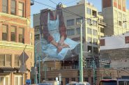 Apr 19th, 2020 by Tom Bamberger
-
Scooters Are the Future
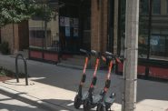 Dec 19th, 2019 by Tom Bamberger
-
Homeless Tent City Is a Democracy
 Aug 2nd, 2019 by Tom Bamberger


The top picture looks like a window air conditioner.
This at least has more interest to me than all the basic box shaped apartment buildings being built around downtown.
Yeah, it sure is interesting in the worst way possible. It could have been worse though, look at anything built on UWM’s campus from 1970-1980.
I watched this being built and all I could think of was “why are they trying to make it look like a 1970’s swimming pool complex?”
It already looks outdated to me and it’s not even finished.
The design isn’t great, but I don’t think it’s that bad either considering the context. I think the biggest problem with this building is that horrific tan color. Tan almost always looks bad on modern buildings in my opinion, and to choose that color to mix with a bunch of glass and aluminum? Why? It just makes the building look cheap, tacky, and unfortunately it will now be a permanent focal point of campus.
If I had to pick a color in place of tan, I would pick black, but would be open to anything reasonable that isn’t at complete odds with silver and glass.
It seems they tried too hard. Less is more. more or less.
Well, keep in mind that this is a state facility, following the state’s bidding process. Other than the historic Downer buildings and Mitchell Hall, from the era prior to state takeover, the campus is evidence of the result of preference for the lowest bidder.
I understand this review is focused on the exterior of the new building, but let’s wait until we can see the spaces inside plus the landscaping before making big judgments. I hope that well-placed trees and natural stormwater management will enhance the pedestrian experience nearby.
I’m not aware of research labs which look like Calatravas. What other precedents are we referencing for a building designed to support students, faculty, staff and labs?
If a house is a machine for people living, an art museum is a machine for people attending fancy receptions, and an office is a machine for people processing papers, I think this building will function well as a machine for people conducting university research. But it shouldn’t try to look like any of those other things.
If nothing else, this building has generated some hilarious comparisons (window air conditioner, 1970s swimming pool complex, and motel room thermostat)! But don’t laugh at the inherent good news: the state actually can afford to invest in our university, enable important research (STEM fields), and at a low cost. And the essentials of a great university do *not* include heart-stopping architecture. Ever take a walk around MIT? At the other extreme, are Wisconsin tax payers really supposed to foot the bill for something like Frank Gehry’s art museum at Univ of Minnesota? I encourage the urbanmilwaukee journalists to visit the building 2 years from now and write about the research, teaching and social contributions of the people *inside* the building.
It’s interesting that Milwaukee is so keen to accept poor quality architecture or come to critique a project long after any changes can be made.
Have you seen any of the buildings going up for UW-Madison lately? They probably have a bunch of trendy, low-quality products of the “state’s bidding process”, right?
We need to get out of our bubbles more.
The design made me think of the design of the newer U.S. Federal Building in San Francisco where the unattractive qualities of the exterior actually serve a purpose. (I think I watched the story of that building’s design and the features and functions of the facade in the E². Design series DVD, available from libraries.)
I like it.
John:
I am not talking about “heart-stopping” architecture. I recently walked around MIT… and there are lots of good buildings (the least of which is a Frank Gehry).
I am talking about making buildings that are not idiotic. A building doesn’t have to make a statement like logo.
Also, why ascribe the “function” to the inside of a building? The reason I write about the outside of buildings is that is their function for us, the public.
Paint the tan sections black to improve the look. Matte or glossy, just get that hideous tan covered.
What a lot of pretentious drivel. This is the best looking building on campus since the Downer buildings, and all you cognoscenti can do is sneer in the hope the others will admire your sophistication.
I’m surprised no one has yet blamed Scott Walker and the Republicans for foisting off on us UWM’s best looking building in a hundred years. Shame on those nasty Rethuglicans!
Of course, maybe all you sophisticates prefer the Union. Or the Klotsche Center. Or Golda Meir Library. Let’s try Bolton Hall if you prefer real beauty. While we’re at it, let’s kick back in Spaights Plaza for a heartwarming aesthetic experience.Those are some real winners. We really should have more such.
I’ll still pick the KIRC building as better, though. A lot better.
Beware of falling icicles.
(Just sayin’)
Well after several months to think about it, I still come to the conclusion, WTF? I’m not trying to be a “sophisticate” and I wouldn’t qualify anyway. But I look at that first picture and it really does look like an air conditioner. Form follows function and I’m not seeing any function at all, just a lot of wasted materials.
Whatever.