Art Museum Drops Design, Re-Hires Shields
In a remarkable turnabout, the Milwaukee Art Museum scraps its controversial design and brings back the city's leading museum architect.
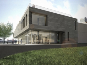
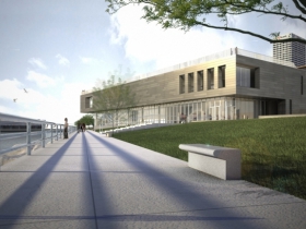
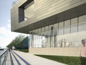
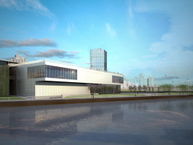
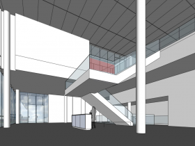
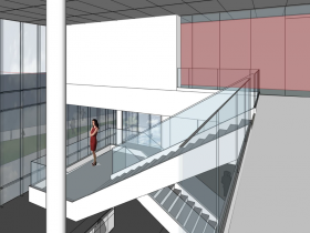
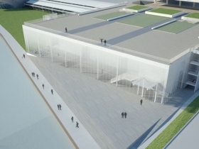
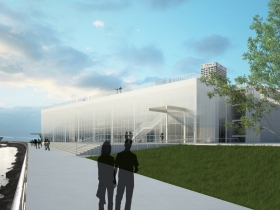
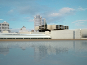
In a stunning turnabout, the Milwaukee Art Museum has announced it is bringing architect Jim Shields back to design its planned addition to the museum, and has released new renderings that he has designed.
The museum had released an earlier design on April 7 and credited it to Shields, but Shields told Urban Milwaukee he had dropped out of the project back in February and that the design wasn’t his. Shields said that as MAM director Dan Keegan brought in other staff to work on the design, ”we just had some basic disagreements. It just wasn’t a good fit for me.”
The museum eventually conceded that Shields was gone from the project and there was now a different leader for the project.
But Urban Milwaukee architecture critic Tom Bamberger questioned the results, calling the revised design a huge comedown from what Shields had designed. This, he wrote, “is a monumental blunder and cannot, must not be built.”
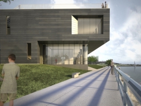
Shields said the adjoining War Memorial was designed to have a weathered appearance to mark the passage of time, and hopes to reference that in the new addition with metals that will patina over time. Dark zinc and a naturally weathered copper are two options, he said. “We’re joining the Saarinen and Kahler buildings (War Memorial) that are supposed to show… (the)advance of time, versus the Calatrava, which is forever gleaming,” Shields said.
It’s too early to offer any judgment on the new design, other than to say it’s a very good sign that Shields is back on the job. Meantime, you’ll find the new renderings below. Your comments are welcome.
May 2014 Renderings
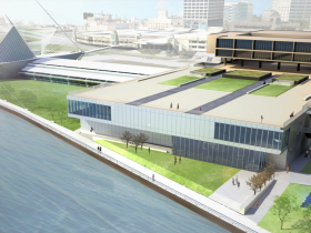
April 2014 Renderings
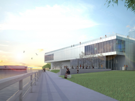
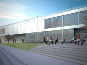
May 2012 Renderings
Back in the News
-
MAGA Republicans Hate Robin Vos
 Dec 26th, 2023 by Bruce Murphy
-
Ron Johnson Looks Foolish on CNN
 Dec 13th, 2023 by Bruce Murphy
-
County Voters Oppose Brewers Bailout
 Sep 11th, 2023 by Bruce Murphy












It’s still ugly and disappointing.
I think each version is getting worse. There are ways to make a cantilevered design simple, yet striking and modern, such as like the Maxxi in Rome, by Zaha Hadid: http://www.designboom.com/cms/images/ridcue/maxi19.jpg – Of course it’s a high standard to meet, but we have to have higher standards if this building will be sitting on our lakefront for the foreseeable future.
I second that Brian.
The simplest move would be to get rid of the embarrassing surface parking lots on the north side of the museum. The museum grounds and the lakefront should be for people to enjoy, not for parking sheet metal out in the sun (or snow).
Related to the architecture, it is hard to understand the connection between the included graphics and the existing structures since they aren’t in the renderings. The details of the ground story in particular will be important for both the visual experience in and out of the museum and the relationship of the solid mass floating on this slim glass wall.
Either way, exciting to have someone back in the drivers seat designing this structure! Congrats Jim.
I still like the original design the best, but the latest May 2014 rendition is light-years ahead of the April 2014 design. The April design looked like they were preparing to eventually sell the museum building to Target or Best Buy. Thank goodness there was some compromise.
does anyone else think the top of this design too heavy for the bottom part. ugh
Where is the lakeside entrance?
I actually prefer the first design. I may go against the grain by saying this, but I have never like the cement block that has been there and would prefer to see more aspirational looking buildings on the lakefront. I understand it was work done by a famous architect, but I know of few people to visit the museum for that reason.
I do wonder why the art museum has not talked about expanding north at all? Seems like a large chunk of unused space that’s fairly hidden from view by the Mason Street ramp.
To paraphrase Potter Stewart, “Like porn, I know good architecture when I see it.” Thanks Bruce for getting the conversation started on this.
To paraphrase Justice Potter Stewart, “Like porn, I know good architecture when I see it.” Thanks Bruce for getting the conversation started on this.
The latest design is an improvement over the April renderings, but not a huge one. A bit heavy looking compared to the glass curtain wall design from 2012. Hard to tell how well it ties into the surrounding War Memorial and Calatrava addition from the rendered views shown. At least they are reevaluating the design. Still not perfect, but a start. I really feel that something better could be done with the north side of the facility too other than a blank concrete wall and a beat up surface parking lot. What about an underground parking ramp with a landscaped park or terrace on the top?